MLOps – Tracking Model Metrics Using Power BI
In the age of MLOps, where you may have automated re-training (and even maybe automated re-deployment) set up, it’s so important to be able to monitor performance of trained models so you know how it’s changing over time.
Also, just having the metrics on the overview of your data can hide biases. For example, what if you wanted to know how well a sales prediction model would perform in certain countries, or a tumour prediction model was performing on black females relative to the entire sample? So we’ll also show how we can slice data to determine whether models are performing better/worse on different subsets of the data and have our metrics autoupdate.
The model tracking dashboard .pbix file and associated data can be found in the repository for this blog post:
In this post we’re going to be creating a very simple dashboard to report the model metrics of a regression model using Power BI, with a little bit of DAX.
https://github.com/benalexkeen/model_tracking_dashboard
A couple of screenshots of what we’ll be creating are shown below:
![]()
Quick disclaimer: At the time of writing, I am currently a Microsoft Employee
Dataset
The dataset we’ll be using here is the famous Boston Housing Dataset. The Boston Housing Dataset is a dataset often used for testing simple regression techniques and is used to predict the house prices in Boston Housing Districts.
This data is from 1978, so you’ll note that the prices are far lower than one might expect from Boston Housing Districts.
The original dataset has the following columns:
- CRIM: per capita crime rate by town
- ZN: proportion of residential land zoned for lots over 25,000 sq.ft.
- INDUS: proportion of non-retail business acres per town
- CHAS: Charles River dummy variable (= 1 if tract bounds river; 0 otherwise)
- NOX: nitric oxides concentration (parts per 10 million)
- RM: average number of rooms per dwelling
- AGE: proportion of owner-occupied units built prior to 1940
- DIS: weighted distances to five Boston employment centres
- RAD: index of accessibility to radial highways
- TAX: full-value property-tax rate per \$10,000
- PTRATIO: pupil-teacher ratio by town
- B: 1000(Bk – 0.63)^2 where Bk is the proportion of blacks by town
- LSTAT: % lower status of the population
The target column is given in our dataset as “PRICE”, the median price of the houses in the housing district in \$1000’s.
We have then simulated the training of 2 models – “Random Forest Regressor” and “Linear Regressor” on this data as if we had fewer training samples one week (10th August), and then had more training samples the week after (17th August) – just as you may have in a production system as you accumulate training data over time.
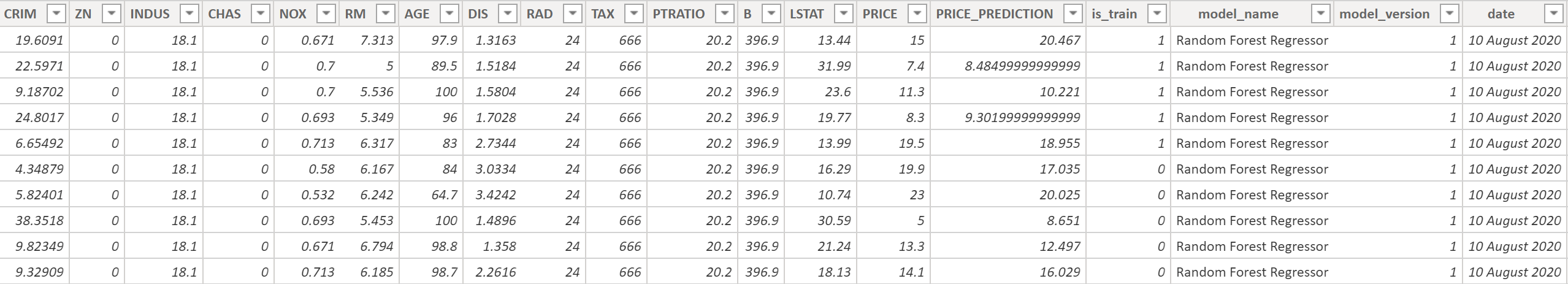
After training these models we have appended more columns to our dataset:
- PRICE_PREDICTION: Model’s prediction of district price in \$1000’s
- is_train: Boolean value for if the data has been used as training data (1) or test data (0)
- model_name: Name of the model that was trained
- model_version: Version number of the model that was trained
- date: Training date
Depending on the size of the dataset, we might keep the training history for 3-12 months and we would store this information in our data warehouse or data lake and connect our dashboard up to it. When you publish a dashboard to Power BI and it’s connected to a dataset – this can be set on a refresh timer to get the latest data e.g. every week after your re-training pipeline.
If you want use a new report to connect to our dataset, click on “Get data”, then pick “Text/CSV” and press “Connect”
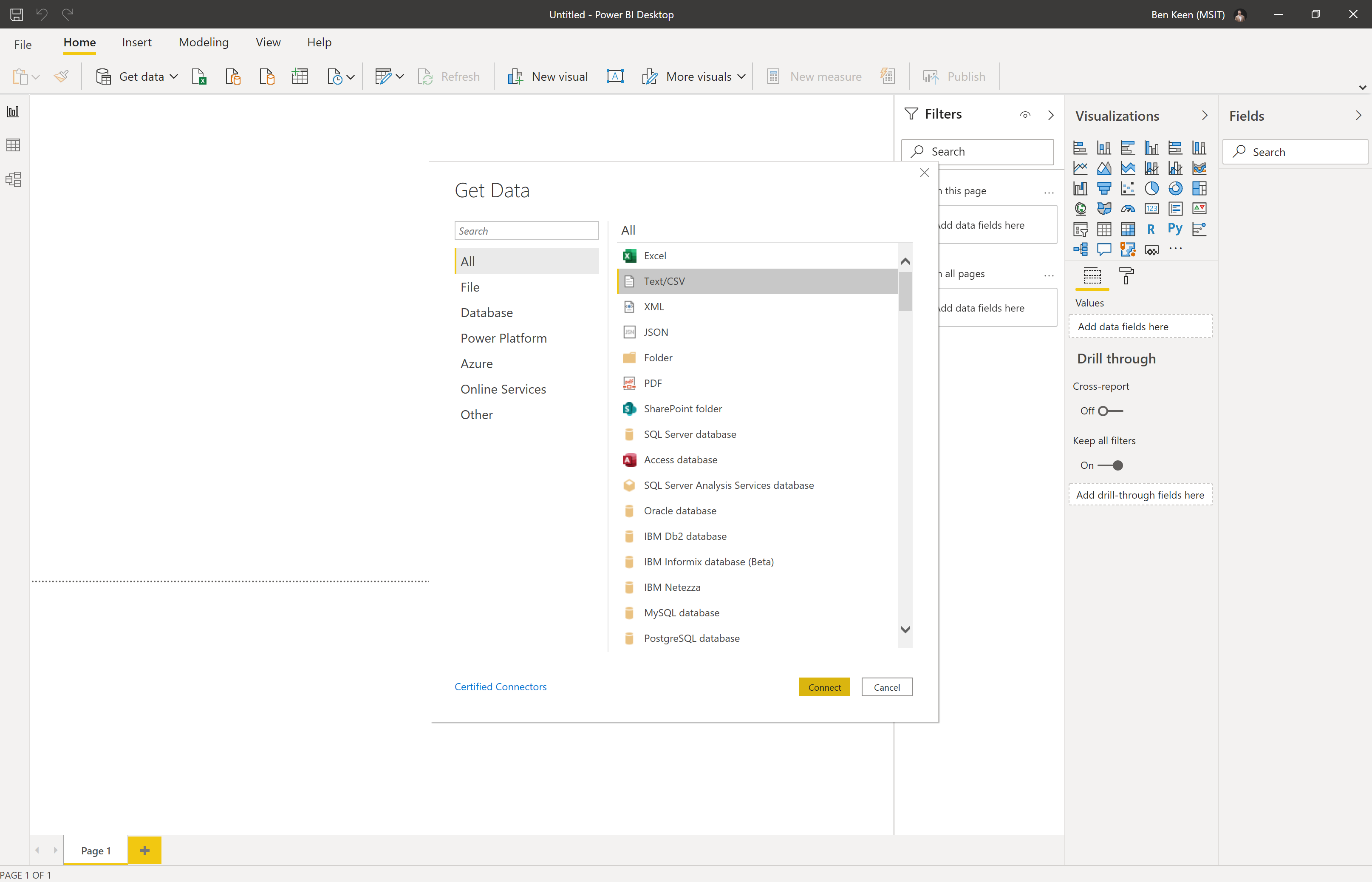
Then navigate to where you’ve saved the model_metric_tracking.csv file. On the popup that comes up, click on the “Load” button and you should have the data loaded in as below:
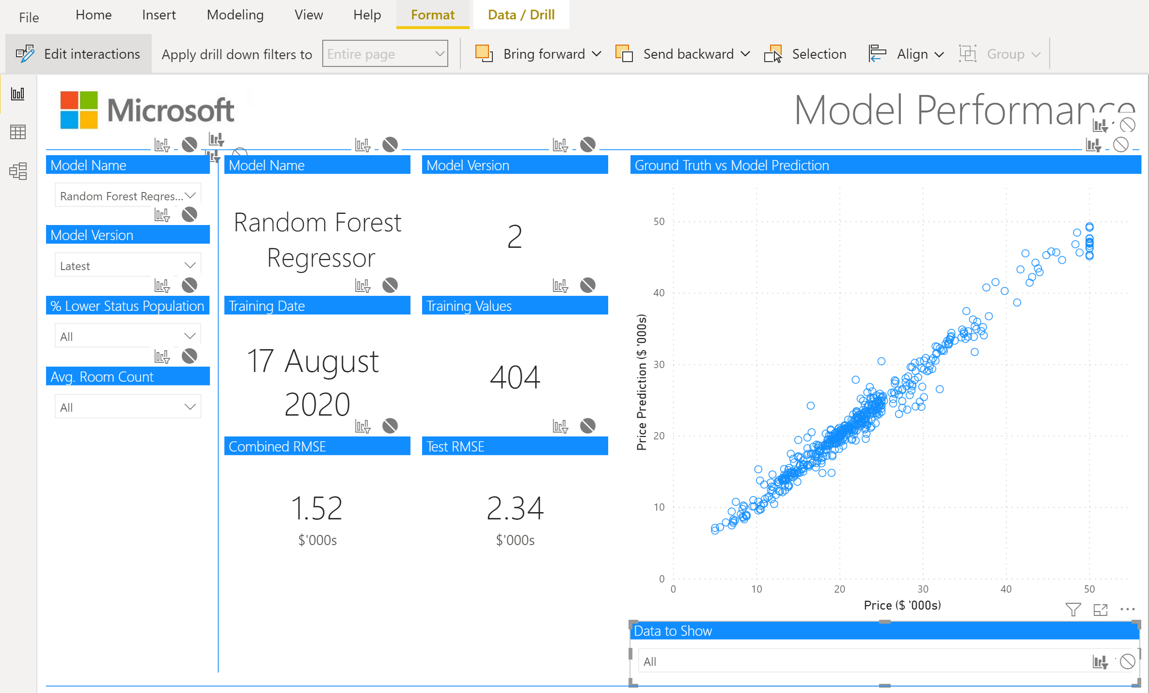
Model Metrics Tracking Page
Now that we’ve got our data loaded in, we’re going to start with creating the tracking page. This is for tracking the model metrics over time and this line chart would build up over time, we can also see which model is currently deployed:
![]()
This is a pretty simple dashboard, but we’ll need a little DAX to get it going.
First we’re going to want to create a new column, so in our Data tab, click “New column” and enter the following DAX to calculate squared error on a per-row basis:
squared_error = POWER(model_metric_tracking[PRICE] - model_metric_tracking[PRICE_PREDICTION], 2)Then we’ll create 2 measures for root mean squared error (RMSE), we’ll have one that gives the combined RMSE (rmse) for both test and training data and one RMSE (test_rmse) for just test data and we’ll use that for our line chart, so click on the “New measure” button and enter the following DAX statements:
rmse = SQRT(AVERAGE(model_metric_tracking[squared_error]))and:
test_rmse = SQRT(
    CALCULATE(
        AVERAGE(model_metric_tracking[squared_error]),
        FILTER(
            model_metric_tracking,
            model_metric_tracking[is_train] = 0
        )
    )
)
Now we can use this test_rmse value in the line chart on our report page. So click on the line chart selection in the Visualizations pane:
Then select the appropriate fields (date for “Axis”, model_name for “Legend”, and test_rmse for “Values”):
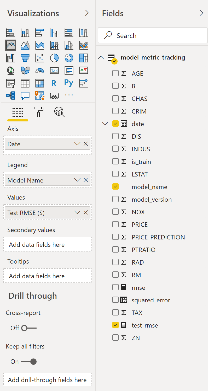
You can then rename these fields appropriately and play around with the formatting until you get something you like and fits your company’s branding.
I have renamed the X and Y axis labels and updated the formatting of the title in the example above.
Below this line chart are 3 text boxes to show the currently deployed model, model version number, and model training date – in a production system these values would likely be retrieved from a database or config file.
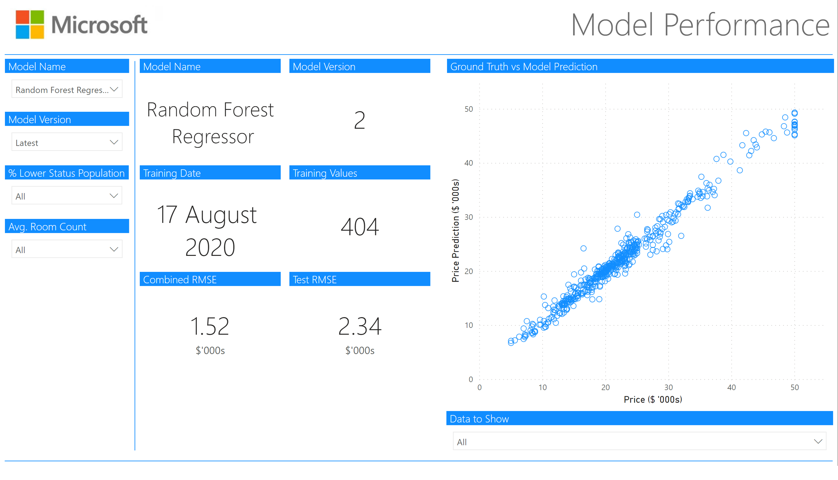
Model Performance
The model performance page is used to drill down into the performance of each individual model and slice the data to determine whether the model performs better/worse on different subsets of the data.
We want this page to show a single version of a single model, so we’ll inform the user they need to select a model and version number if they haven’t selected one. So we create 2 more “New measure”s using DAX:
selected_model = IF(
    DISTINCTCOUNT(model_metric_tracking[model_name]) > 1,
    "Select A Model",
    MIN(model_metric_tracking[model_name])
)
selected_version = IF(
DISTINCTCOUNT(model_metric_tracking[model_version]) > 1,
"Select A Version",
MIN(model_metric_tracking[model_version])
)Now that we’ve got these, we can insert our cards and slicers.
Slicers
We’ll start with the slicers:
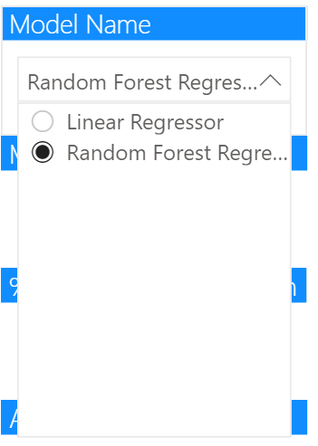
Model Name
The first slicer on the left is our model name slicer, so we insert a slicer and provide model_name as the field. Under “Selection controls” we’ll want to ensure “Single select” is on. We can also make this slicer a “Dropdown” rather than a “List”. Then we can select a single model as shown:
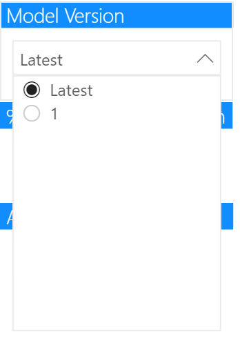
Model Version
The second slicer on the left is our model version slicer, we’ll let a user select the “latest” model. The reason for this is that we can then ensure this page will always show the latest model, even after re-training.
This is given as a “New column” as below, if the model version is the same as the maximum model version for that model name we return “Latest”, otherwise we return the number as a string:
latest_version_number = IF(
    CALCULATE(
        MAX(
            model_metric_tracking[model_version]
        ),
        ALLEXCEPT(
            model_metric_tracking,
            model_metric_tracking[model_name]
        )
    ) = model_metric_tracking[model_version],
    "Latest",
    CONVERT(model_metric_tracking[model_version], STRING)
)
As this is now a string and you’ll get odd issues when sorting, like having “1”, “10”, “2”… instead of “1”, “2”…”10″, we’ll want to sort this by our model_version column. We can do this by clicking on the field and then in “Column Tools” selecting the “Order by Column” button and clicking on “model_version”.
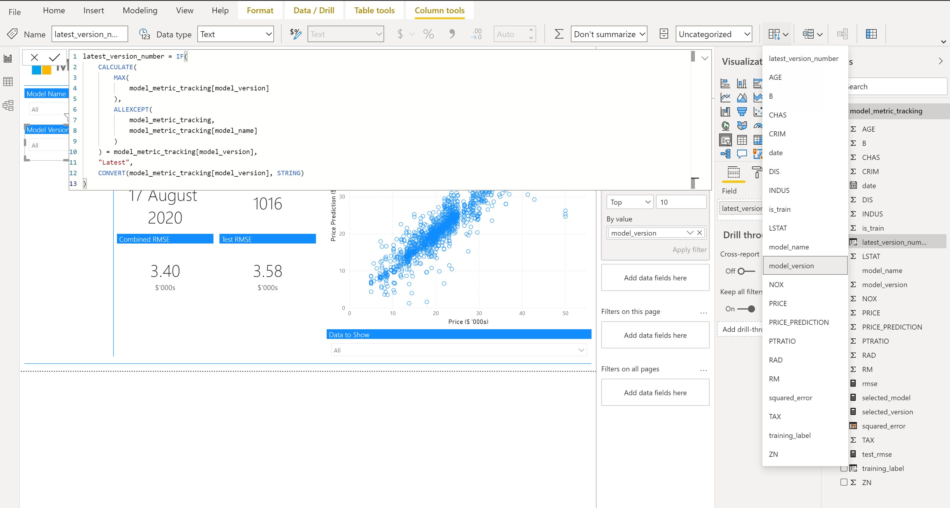
We then need to make sure we select “Sort descending” to ensure that latest shows up first and the most recent trained models follow.
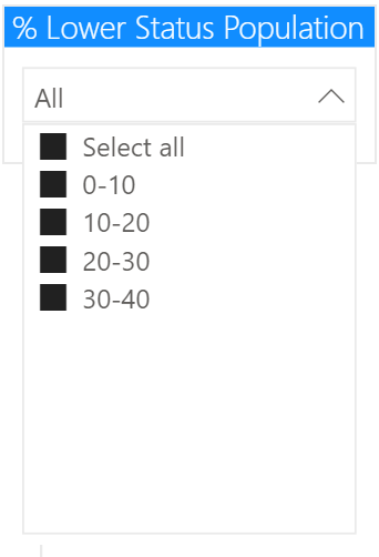
% Lower Status Population
The 2 most important features for predicting average district house prices were “LSTAT” and “RM” so we’ve created slicers for these to see how our model performs on different subsets of data here.
“LSTAT” is “% Lower Status Population” and we want to bin this for our slicer. This has been done as follows in DAX using the SWITCH statement to create a “New column”, there are no percentage values above 40:
LSTAT_BINNED = SWITCH(
    TRUE(),
    model_metric_tracking[LSTAT] < 10,
    "0-10",
    model_metric_tracking[LSTAT] < 20,
    "10-20",
    model_metric_tracking[LSTAT] < 30,
    "20-30",
    "30-40"
)
We use this calculated column for the slicer. For the dropdown here we provide the option to “Select All”:
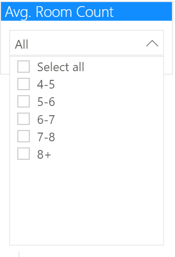
Avg. Room Count
As mentioned above, the other important feature for predicting average district house prices was “RM”, which is the average number of rooms. Again we bin this data using DAX in a “New column”:
RM_BINNED = SWITCH(
    TRUE(),
    model_metric_tracking[RM] < 5,
    "4-5",
    model_metric_tracking[RM] < 6,
    "5-6",
    model_metric_tracking[RM] < 7,
    "6-7",
    model_metric_tracking[RM] < 8,
    "7-8",
    "8+"
)
Again, we use this calculated column for the slicer.
Cards
Next to the slicers we have our cards, these will update based on the choices in the slicers.
For each card, we’ve turned on the title and updated the formatting of the title and turned the category off (except for the last 2 where we use it to indicate $'000s for RMSE).
This is copied for all 6 cards shown:
- Model Name (selected_model)
- Model Version (selected_version)
- Training Date (date – select “Latest” for aggregation)
- Training Values (is_train – select “Sum” for aggregation)
- Combined RMSE (rmse)
- Test RMSE (test_rmse)
Scatter Chart
We create a scatter chart to show how the model performed on each data point vs the ground truth, so start by selecting a Scatter Chart:
Then select the appropriate fields ("PRICE" for X Axis and "PRICE_PREDICTION" for Y Axis):
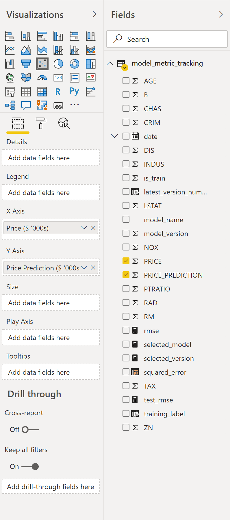
Some changes we’ll need to make to this scatter chart:
- Click on Dropdown menu for Y Axis and click Don’t Summarize
- If you have a lot of data to show, increase the data point limit
- I choose not to fill the points as the level of the transparency by default is quite low so it’s difficult to determine the density of points
Data to Show selection
There is a slicer below the scatter chart, from which you can choose to select the data you want to see in the scatter chart from:
- Select all
- Test
- Training
This is done by creating a new calculated column in DAX:
training_label = IF(model_metric_tracking[is_train] = 0, "Training", "Test")And creating a slicer from this new calculated column. However, as we only want to have this slicer select the data down on the scatter chart and not on our cards, we need to turn off those interactions. We can do that by selecting our slicer, then in the “Format” ribbon, select “Edit interactions” and turn off all the interactions with other visualizations that aren’t the scatter chart:
Publishing the Report
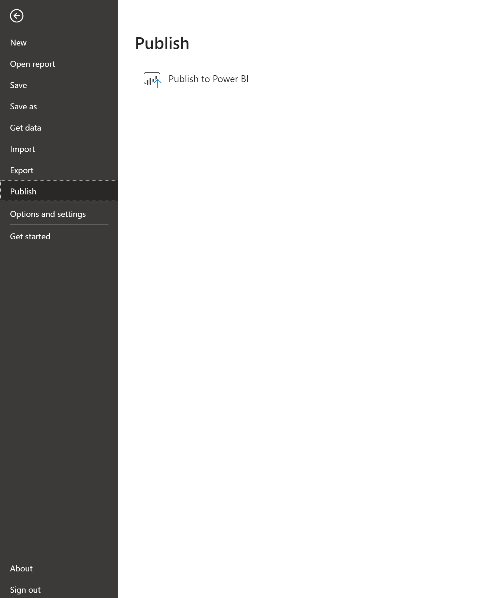
To publish the report to a powerbi.com workspace, click on “File”, “Publish” and “Publish to Power BI”
Then, as mentioned above, we can have our dataset on a timed refresh set up to refresh after our model re-training pipelines.
And there we have our simple model metrics report. You could have a go at doing this for a classification model and customising it for your own needs.