Creating graphs using flask and D3
There are some great libraries out there to help you get up and running quickly with interactive JavaScript graphs, including C3, NVD3, highcharts and plotly.
However, most of these are wrappers around the JavaScript graphing library D3 and to get the most power and flexibility out of D3, sometimes you want to use the D3 library itself. In this post we’ll explore using flask as a back-end to serve data that can be used to create D3 graphs on the front end.
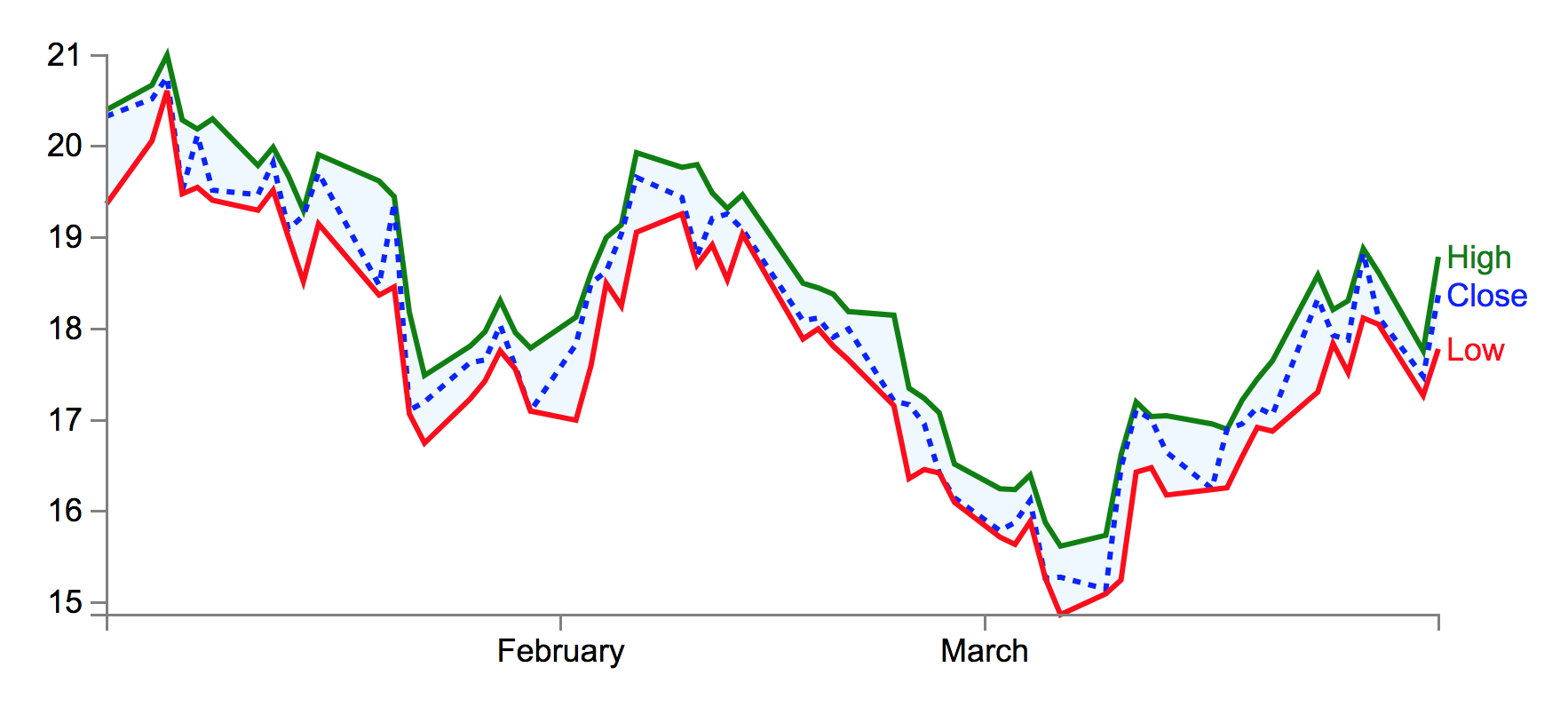
This will be a very simple example and I will be creating more posts about some slightly more advanced d3 graphs in the coming weeks. The graph we’ll be creating is below:
The code for this blog post can be found on GitHub here.
Data
We’re going to start with some MSFT stocks OHLC data and we’re going to plot a line chart with the high, low and closing values in it. The data looks like this, this is what is kept in our data.csv file:
Date,Open,High,Low,Close
2009-03-31,17.83,18.79,17.78,18.37
2009-03-30,17.74,17.76,17.27,17.48
2009-03-27,18.54,18.62,18.05,18.13
...
2009-01-02,19.53,20.4,19.37,20.33
Flask Application
The python script below shows a minimal flask application.
For simplicity’s sake, we are using pandas to read the csv and drop the 'Open' column.
Our app.py file looks like this:
import json

from flask import Flask, render_template
import pandas as pd

app = Flask(__name__)

@app.route("/")
def index():
    df = pd.read_csv('data').drop('Open', axis=1)
    chart_data = df.to_dict(orient='records')
    chart_data = json.dumps(chart_data, indent=2)
    data = {'chart_data': chart_data}
    return render_template("index.html", data=data)


if __name__ == "__main__":
    app.run(debug=True)
Notice that we pass the data to the front end after casting our data to a list of dicts (df.to_dict(orient='records')), so our data is in the format:
[
    {'Date': '2009-03-31', 'High': 18.79, 'Low': 17.78, 'Close': 18.37},
    {'Date': '2009-03-30', 'High': 17.76, 'Low': 17.27, 'Close': 17.48},
    {'Date': '2009-03-27', 'High': 18.62, 'Low': 18.05, 'Close': 18.13},
    ...
    {'Date': '2009-01-02', 'High': 20.4, 'Low': 19.37, 'Close': 20.33}
]
Before being sent to the front end as a JSON string.
HTML
Our index.html file looks like this:
<!DOCTYPE html>
<html lang="en">
<head>
    <meta charset="utf-8">
    <style>
        // our CSS here!
    </style>
</head>
<body>
    <div id="graphDiv"></div>

    <script src="http://d3js.org/d3.v3.min.js"></script>
    <script>
        // Our Custom D3 JavaScript here!
    </script>
</body>
</html>
A basic, stripped down html file, with one div graphDiv that we will use to place our graph svg.
CSS
We’re going define some style for our graph. We’re going to make the font size 12px and the font Arial, instead of the default serif font.
body { font: 12px Arial;}
For our line paths, we’ll give them a stroke-width of 2 px and turn off the fill, which is on by default.
path {
  stroke-width: 2;
  fill: none;
}
For the axis, we’ll turn off the fill too and set a stroke-width of 1 px.
.axis path, .axis line {
  fill: none;
  stroke: grey;
  stroke-width: 1;
  shape-rendering: crispEdges;
}
We’ll fill in the area between the low and high values with a light blue colour:
.area {
  fill: #F0F8FF;
  stroke-width: 0;
}
JavaScript
First we access the data we sent to the front end using jinja.
var graphData = {{ data.chart_data | safe }}
Now we’ll set some dimensions for our svg and graph.
var margin = {top: 30, right: 50, bottom: 30, left: 50};
var svgWidth = 600;
var svgHeight = 270;
var graphWidth = svgWidth - margin.left - margin.right;
var graphHeight = svgHeight - margin.top - margin.bottom;
We write a function to parse the dates in our data, using the same directives we do in python’s strftime (for reference, see strftime.org)
var parseDate = d3.time.format("%Y-%m-%d").parse;
We’ll then define the ranges for our data that will be used to scale our data into the graph, for the x axis, this will be 0 to the graphWidth. On our y axis, we are going the other way as we want our lower values to appear at the bottom of the graph, rather than the top.
var x = d3.time.scale().range([0, graphWidth]);
var y = d3.scale.linear().range([graphHeight, 0]);
We can then define our axes, we’ll set a number of ticks but D3 will choose an appropriate value that is below the number of ticks we choose.
var xAxis = d3.svg.axis().scale(x)
    .orient("bottom").ticks(5);
var yAxis = d3.svg.axis().scale(y)
    .orient("left").ticks(5);
We can define a line for our line for the high data:
var highLine = d3.svg.line()
    .x(function(d) { return x(d.Date); })
    .y(function(d) { return y(d.High); });
We’ll follow that up with the lines for the rest of close and low values:
var closeLine = d3.svg.line()
    .x(function(d) { return x(d.Date); })
    .y(function(d) { return y(d.Close); });
var lowLine = d3.svg.line()
    .x(function(d) { return x(d.Date); })
    .y(function(d) { return y(d.Low); });
We’ll define an area across the whole of the date range on the x axis and between the Low and the High values from our data on the y axis.
var area = d3.svg.area()
    .x(function(d) { return x(d.Date); })
    .y0(function(d) { return y(d.Low); })
    .y1(function(d) { return y(d.High); })
We’ll add the svg canvas to the graphDiv div we’ve defined in our HTML file:
var svg = d3.select("#graphDiv")
    .append("svg")
        .attr("width", svgWidth)
        .attr("height", svgHeight)
    .append("g")
        .attr("transform",
        "translate(" + margin.left + "," + margin.top + ")")
Now that we’ve written our set up, we’re ready to write a function to draw a graph:
function drawGraph(data) {
  // For each row in the data, parse the date
  // and use + to make sure data is numerical
  data.forEach(function(d) {
    d.Date = parseDate(d.Date);
    d.High = +d.High;
    d.Close = +d.Close;
    d.Low = +d.Low;
  });
  // Scale the range of the data
  x.domain(d3.extent(data, function(d) { return d.Date; }));
  y.domain([d3.min(data, function(d) {
      return Math.min(d.High, d.Close, d.Low) }),
      d3.max(data, function(d) {
      return Math.max(d.High, d.Close, d.Low) })]);
  // Add the area path
  svg.append("path")
    .datum(data)
    .attr("class", "area")
    .attr("d", area)
  // Add the highLine as a green line
  svg.append("path")
    .style("stroke", "green")
    .style("fill", "none")
    .attr("class", "line")
    .attr("d", highLine(data));
  // Add the closeLine as a blue dashed line
  svg.append("path")
    .style("stroke", "blue")
    .style("fill", "none")
    .style("stroke-dasharray", ("3, 3"))
    .attr("d", closeLine(data));
  // Add the lowLine as a red dashed line
  svg.append("path")
    .style("stroke", "red")
    .attr("d", lowLine(data));
  // Add the X Axis
  svg.append("g")
    .attr("class", "x axis")
    .attr("transform", "translate(0," + graphHeight + ")")
      .call(xAxis);
  // Add the Y Axis
  svg.append("g")
    .attr("class", "y axis")
    .call(yAxis);
  // Add the text for the "High" line
  svg.append("text")
    .attr("transform", "translate("+(graphWidth+3)+","+y(graphData[0].High)+")")
    .attr("dy", ".35em")
    .attr("text-anchor", "start")
    .style("fill", "green")
    .text("High");
  // Add the text for the "Low" line
  svg.append("text")
    .attr("transform", "translate("+(graphWidth+3)+","+y(graphData[0].Low)+")")
    .attr("dy", ".35em")
    .attr("text-anchor", "start")
    .style("fill", "red")
    .text("Low");
  // Add the text for the "Close" line
  svg.append("text")
    .attr("transform", "translate("+(graphWidth+3)+","+y(graphData[0].Close)+")")
    .attr("dy", ".35em")
    .attr("text-anchor", "start")
    .style("fill", "blue")
    .text("Close");
};
We can then call our function with our data:
drawGraph(graphData);
Running the server
Now we can run our flask server by running:
$ python app.py
and navigating in our browser to http://localhost:5000 and we should see the graph in the picture at the top of this post